A Human Machine Interface (HMI) is a user interface or dashboard that connects a person to a machine, system, or device. An HMI provides a way for a user to interact with the system and receive feedback from the system. HMIs are widely used in industrial automation, control systems, and other applications specially HMI on Brainy Pi with QML
Qt is a popular cross-platform development framework that supports the development of graphical user interfaces (GUIs) and applications. Additionally, Qt provides a set of libraries and tools for developing desktop and mobile applications that can run on various platforms. Moreover, Qt provides a declarative language called QML (Qt Modeling Language) that allows developers to create user interfaces quickly and easily. This is beneficial because it reduces the time and effort required for UI development.
In this tutorial, we’ll create a simple HMI using Qt and QML. First, we’ll create a UI that consists of two vertical sliders for temperature and pressure. Then, we’ll add two text components to display the data and two line charts to visualize the data. This will allow us to have a comprehensive and interactive interface for monitoring temperature and pressure values.
Index
Pre-requisites
HMI Top-level Design
QT Creator Overview
Coding
Running the code
TLDR
Conclusion
Pre-requisites for HMI on Brainy Pi
Install Qt creator
sudo apt update && sudo apt install -y qtbase5-dev qtcreator
Install QML for QT5
sudo apt install qtdeclerative5-dev libqt5qml5
sudo apt install libqt5qml5
sudo apt install qtdeclarative5-dev
sudo apt install qml-module-*
sudo apt install qmlscene
HMI on Brainy Pi Top-level Design
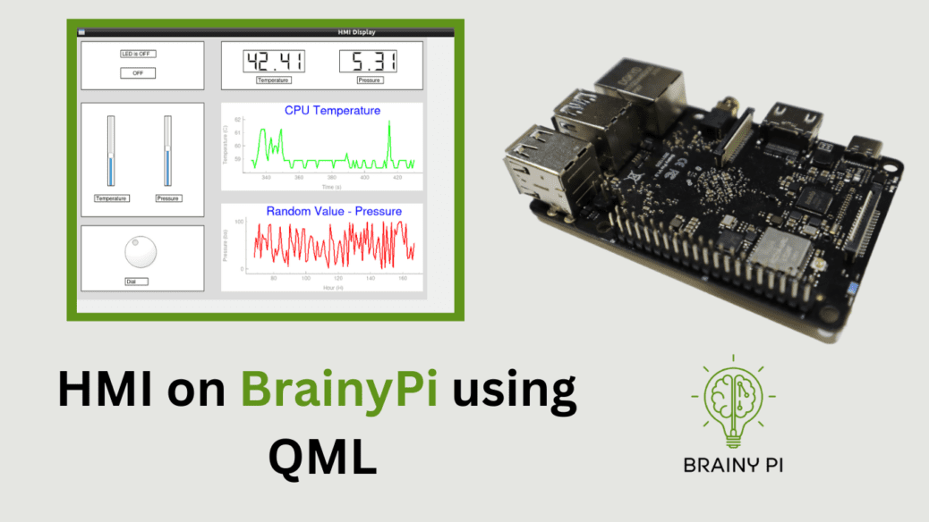
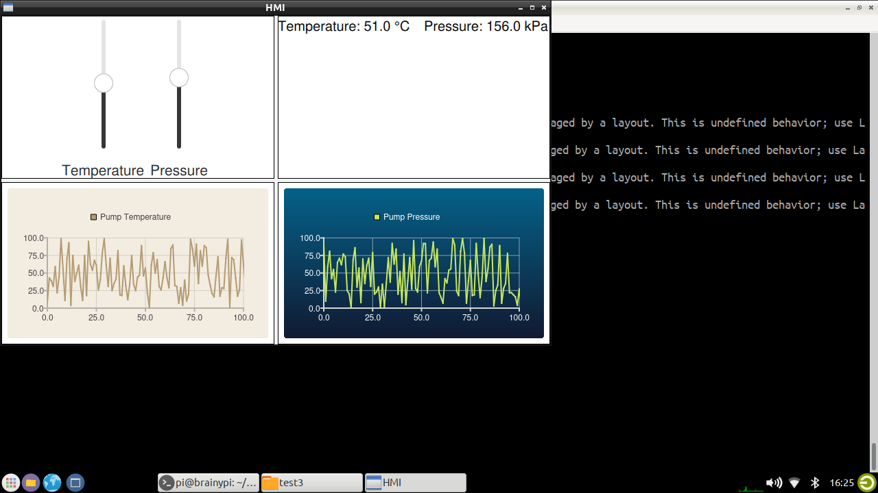
The main window will be divided into 4 parts
Contains 2 Sliders
1 Slider for setting Temperature
1 Slider for setting Pressure
Has 2 text for displaying Temperature and pressure.
2 Graphs
1 Graph which displays Pump temperature (a random value).
1 Graph which displays Pump pressure (a random value).
Finally the HMI would look something like this.

QT Creator Overview
Designing a UI with Qt Creator involves the following steps:
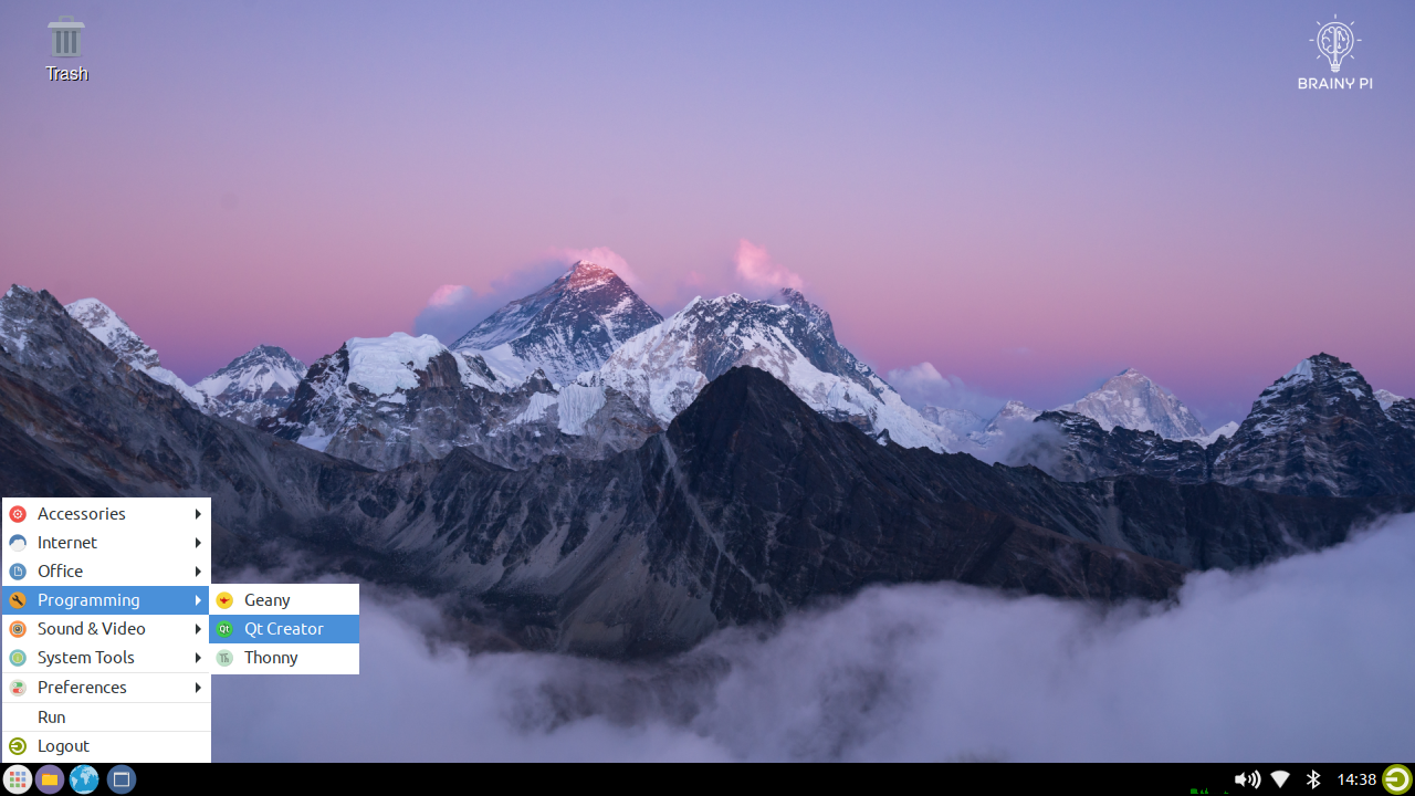
Lets Open QT Creator

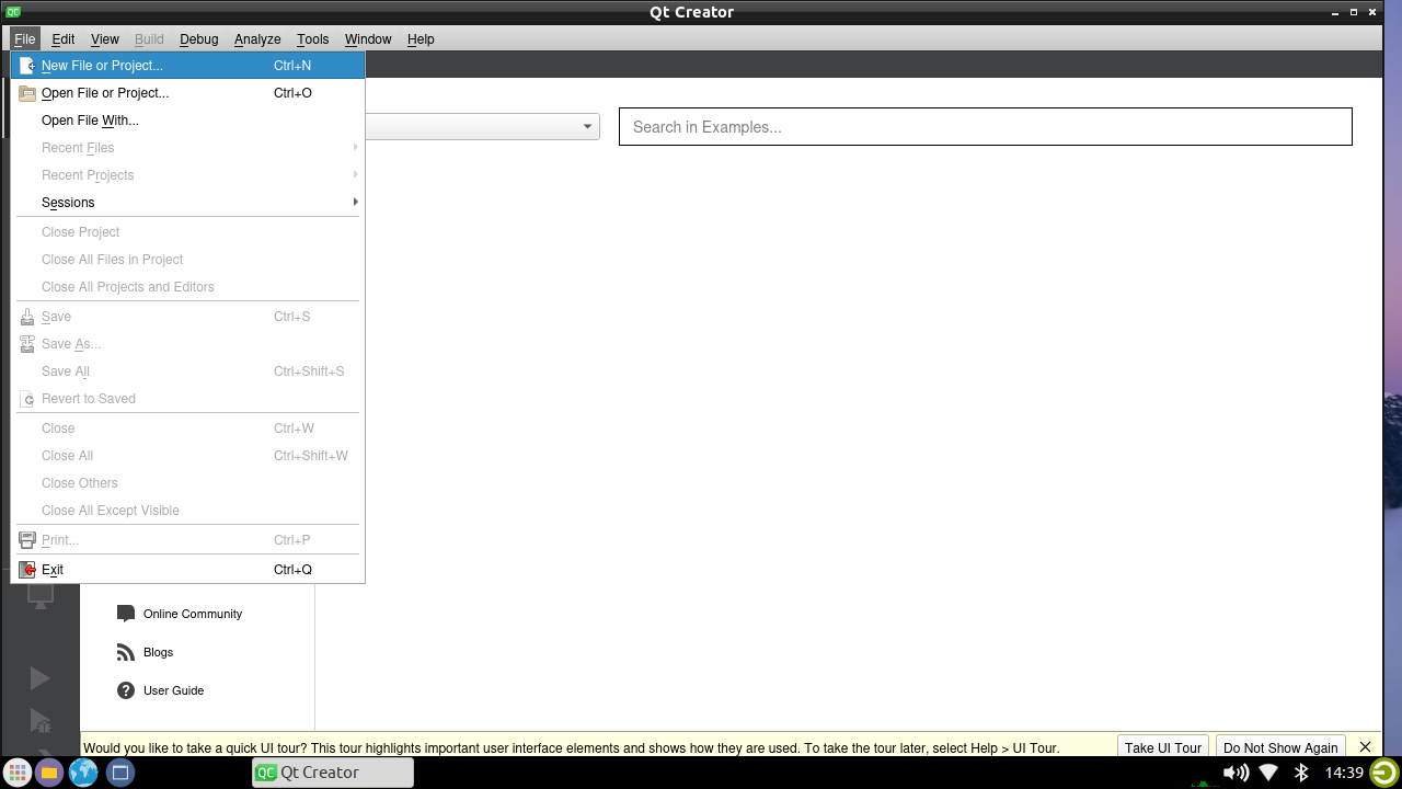
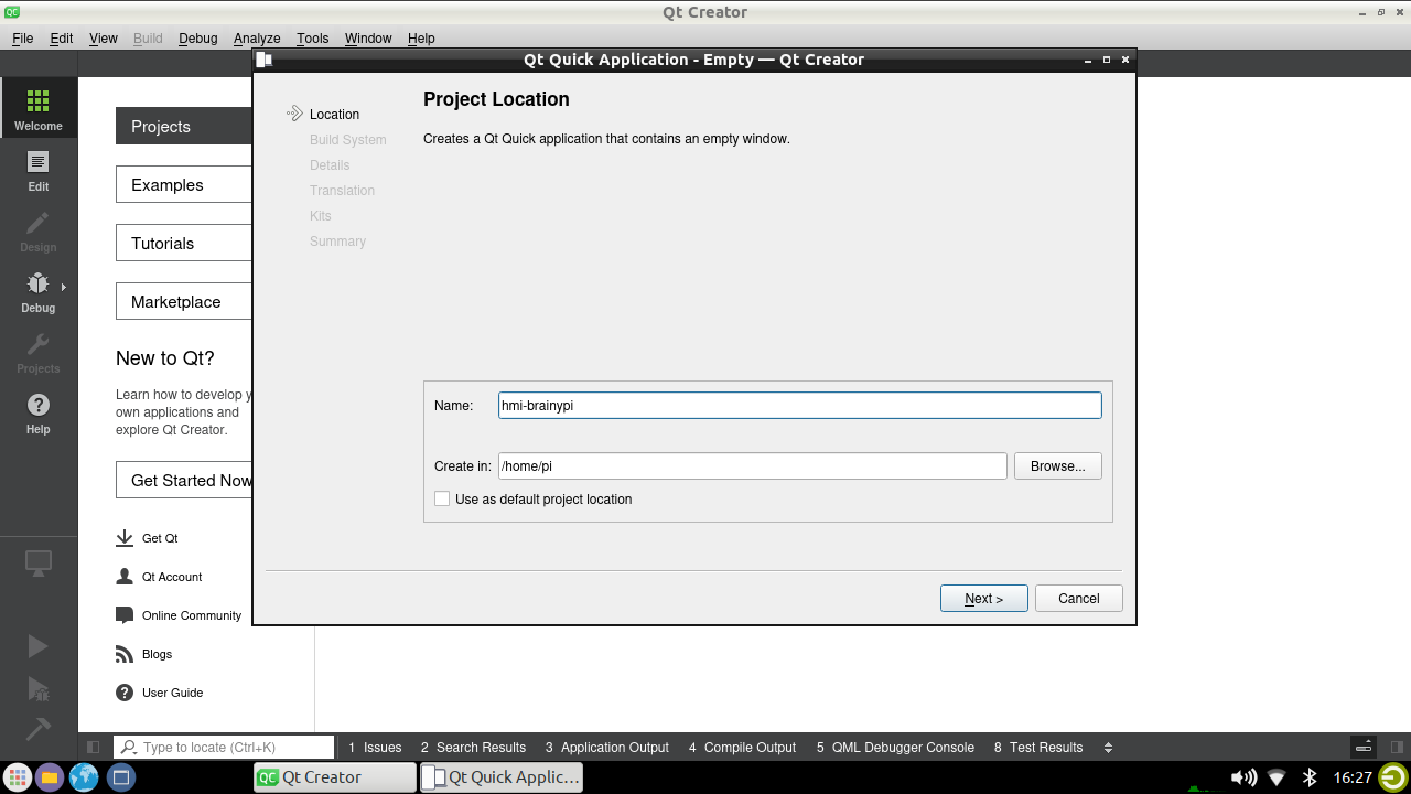
Create a New Qt Project: Launch Qt Creator and create a new Qt project by selecting “File” > “New File or Project” from the menu bar.

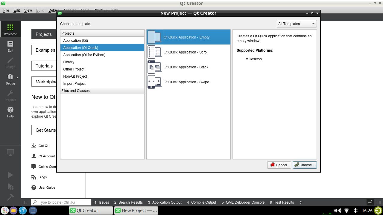
Choose “QT Quick Application” as the project template and click “Next”.

Now, enter the project name and location

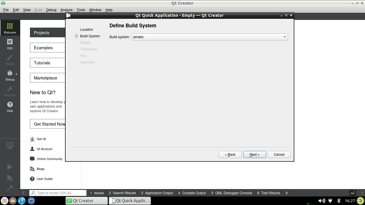
Then, Choose
qmakeas build system.
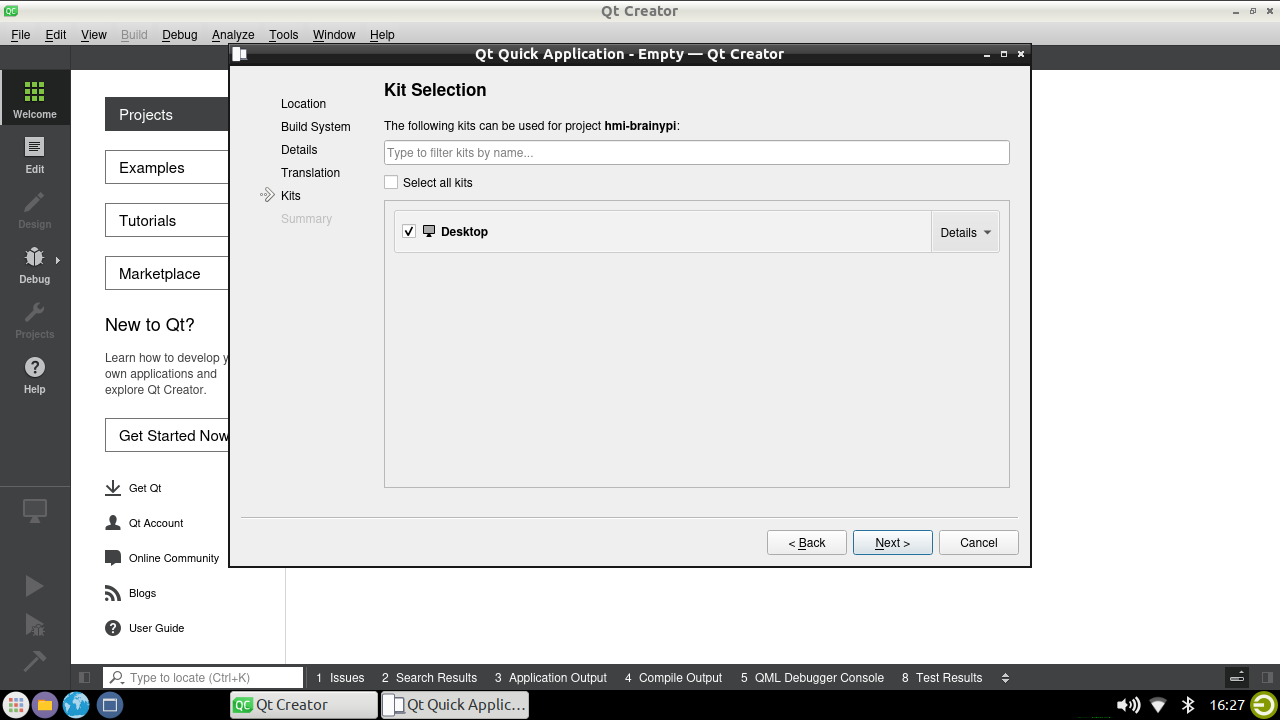
Then, Choose the
Desktopas the kit.
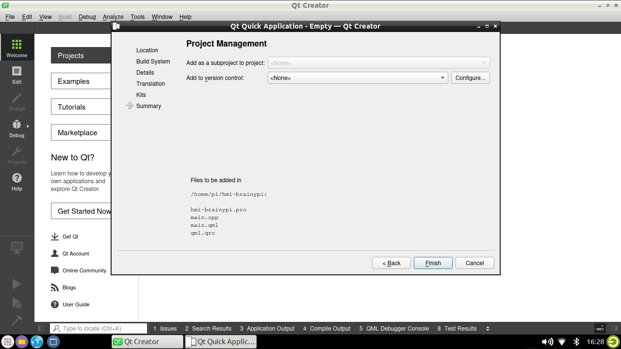
Finally, click “Finish” to create the project.

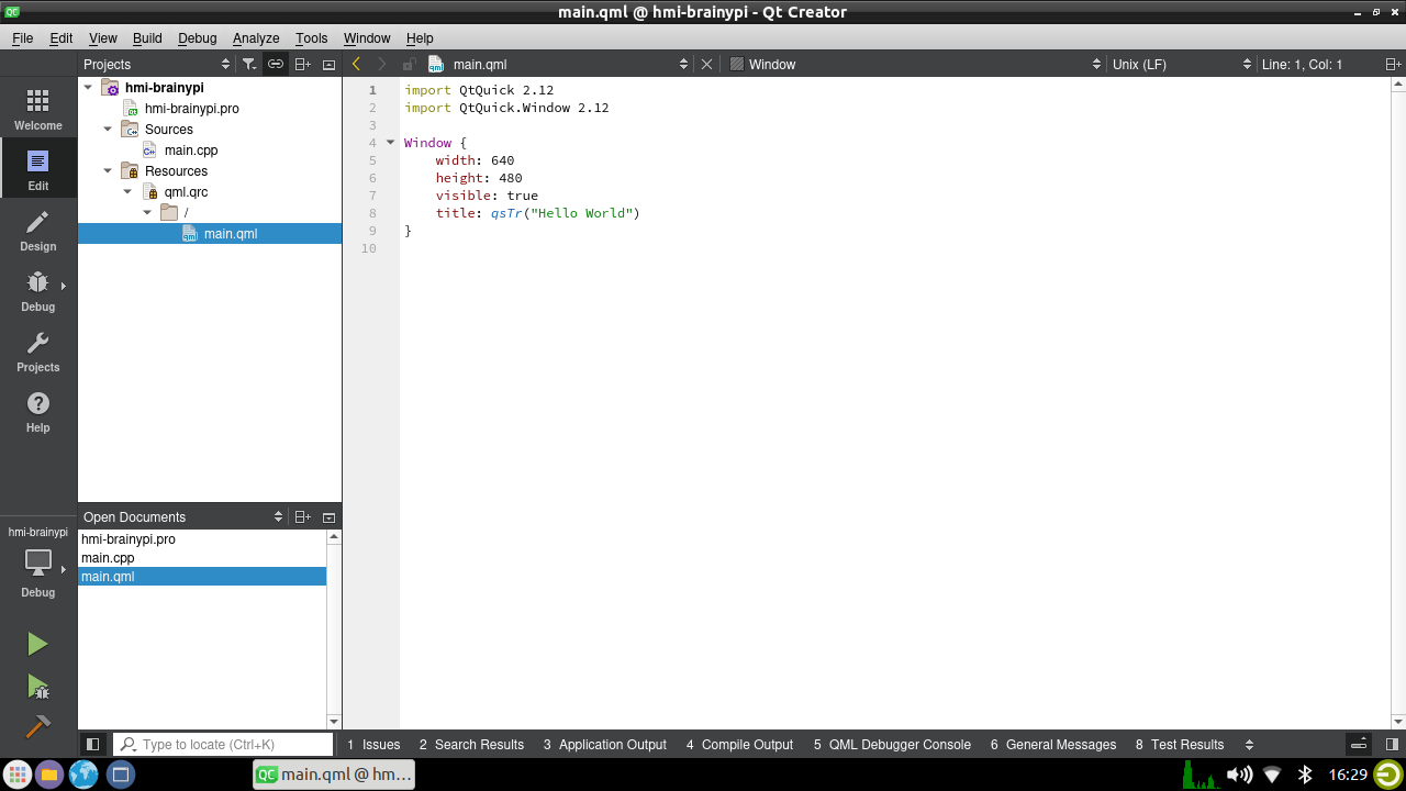
Once the project is created, Qt Creator will open the coding window were we will code the HMI application.

Save the UI: After making changes to the UI, save by selecting “File” > “Save” from the menu bar.
Coding
Implementing the UI designed with Qt Creator in QML, will the split into these parts
Import statements:
import QtQuick 2.12
import QtQuick.Controls 2.12
import QtCharts 2.3
import QtDataVisualization 1.15
import QtQuick.Layouts 1.12
These lines import the necessary Qt modules for the application to run,
QtQuick for creating the user interface,
QtCharts and QtDataVisualization for plotting charts,
QtQuick.Layouts for laying out the user interface elements.
ApplicationWindow:
ApplicationWindow {
    visible: true
    width: 800
    height: 480
    title: "HMI"
    color: "#F2F2F2"
This block of code defines the main window of the application. It sets the window to be visible, with a width and height of 800 and 480 pixels, respectively. The title of the window is “HMI” and the color is set to a light gray.
GridLayout:
GridLayout {
    columns: 2
    rows: 2
    Layout.fillHeight: true
    Layout.fillWidth: true
    anchors.top: parent.top
    anchors.bottom: parent.bottom
    anchors.left: parent.left
    anchors.right: parent.right
The above block of code defines a grid layout with 2 rows and 2 columns that fills the entire window. The anchors are set to make sure that the grid layout fills the entire window.
Sliders and Labels
Rectangle {
    Layout.fillHeight: true
    Layout.fillWidth: true
    border.width: 1
    RowLayout {
        spacing: 50
        anchors.horizontalCenter: parent.horizontalCenter
        Slider {
            id: temperatureSlider
            anchors.horizontalCenter: parent.horizontalCenter
            anchors.horizontalCenterOffset: -50
            value: 20
            from: 0
            to: 100
            orientation: Qt.Vertical
            stepSize: 1
            snapMode: Slider.SnapAlways
        }
        Label {
            text: "Temperature"
            font.pointSize: 16
            anchors.horizontalCenter: temperatureSlider.horizontalCenter
            anchors.top: temperatureSlider.bottom
            anchors.topMargin: 10
        }
        Slider {
            id: pressureSlider
            anchors.left: temperatureSlider.right
            anchors.leftMargin: 70
            value: 50
            from: 0
            to: 100
            orientation: Qt.Vertical
            stepSize: 1
            snapMode: Slider.SnapAlways
        }
        Label {
            text: "Pressure"
            font.pointSize: 16
            anchors.horizontalCenter: pressureSlider.horizontalCenter
            anchors.top: pressureSlider.bottom
            anchors.topMargin: 10
        }
    }
}
It defines a rectangle with a border that fills the first cell of the grid layout. Inside the rectangle, there are two vertical sliders for temperature and pressure, along with labels for each slider.
Text
Rectangle {
    Layout.fillHeight: true
    Layout.fillWidth: true
    border.width: 1

    // Part 2: Text components to display data
    RowLayout {
        spacing: 20
        Layout.fillHeight: true
        Layout.fillWidth: true
        Layout.leftMargin: 10
        Layout.rightMargin: 10
        Text {
            id: temperatureValue
            anchors.horizontalCenter: parent.horizontalCenter - 10
            text: "Temperature: " + temperatureSlider.value.toFixed(1) + " °C"
            font.pixelSize: 20
        }
        Text {
            id: pressureValue
            anchors.horizontalCenter: parent.horizontalCenter + 100
            text: "Pressure: " + (pressureSlider.value + 100).toFixed(1) + " kPa"
            font.pixelSize: 20
        }
    }
}
This part contains two
Textcomponents that display the current values of the temperature and pressure sliders.The
Textcomponents use anchors to position themselves horizontally in the center of theRectangle.temperatureValue– TheTextcomponent with idtemperatureValuedisplays the current value of the temperature slider, formatted to one decimal point and with the string “Temperature: ” prepended to it.pressureValue– TheTextcomponent with idpressureValuedisplays the current value of the pressure slider, formatted to one decimal point, incremented by 100, and with the string “Pressure: ” prepended to it.
Graphs
To create 2 Graphs, we need
Code for graph 1
Code for graph 2
Timer – Which updates the charts after set time.
Code for Graph 1
Rectangle {
    Layout.fillHeight: true
    Layout.fillWidth: true
    border.width: 1
    ChartView {
        id: chart1
        anchors.fill: parent
        theme: ChartView.ChartThemeBrownSand
        antialiasing: true
        LineSeries {
            id: line1
            axisX: ValueAxis {
                min: 0
                max: 100
                tickCount: 1
            }
            axisY: ValueAxis {
                min: 0
                max: 100
                tickCount: 1
            }
            name: "Pump Temperature"
        }
    }

}
This part contains a
ChartViewwith idchart1, which displays a line chart of the pump temperature data.The
ChartViewis anchored to fill the entireRectangle. It uses theChartThemeBrownSandtheme and enables antialiasing.The
ChartViewcontains aLineSerieswith idline1, which represents the pump temperature data.The
LineSerieshas twoValueAxiscomponents, one for the x-axis and one for the y-axis.The
ValueAxiscomponents are set to display a tick count of 1 and a range of 0 to 100.The
LineSerieshas a name of “Pump Temperature”.
Code for Graph 2
Rectangle {
    Layout.fillHeight: true
    Layout.fillWidth: true
    border.width: 1
    ChartView {
        id: chart2
        theme: ChartView.ChartThemeBlueCerulean
        anchors.fill: parent
        antialiasing: true

        LineSeries {
            id: line2
            axisX: ValueAxis {
                min: 0
                max: 100
                tickCount: 1
            }
            axisY: ValueAxis {
                min: 0
                max: 100
                tickCount: 1
            }
            name: "Pump Pressure"
        }
    }
}
This part is similar to part 3, but it displays a line chart of the pump pressure data instead.
The
ChartViewhas idchart2and uses theChartThemeBlueCeruleantheme.The
LineSerieshas idline2and represents the pump pressure data.The
ValueAxiscomponents for theline2series are set up the same way as for theline1series.The
LineSerieshas a name of “Pump Pressure”.
Lets see the code for Timer
Timer {
   interval: 500
   repeat: true
   running: true

   onTriggered: {
       // Update chart values
       var xValue1 = line1.count;
       var yValue1 = Math.floor(Math.random()*100);
       line1.append(xValue1, yValue1);
       // Update chart values
       var xValue2 = line2.count;
       var yValue2 = Math.floor(Math.random()*100);
       line2.append(xValue2, yValue2);
   }
}
This part creates a
Timercomponent that triggers every 500 milliseconds.When the timer triggers, it updates the
line1andline2series with new data points.The x-value for each series is incremented by the current number of data points in the series (i.e., the series count).
The y-value for each series is generated randomly between 0 and 100.
Now the code should be ready
Your code should look something like this – https://github.com/brainypi/brainypi-hmi-example/blob/qml/main.qml
Running the code for HMI on Brainy Pi
Open Terminal and Navigate to your project folder
cd /path/to/project/folder

# For example
# cd /home/pi/hmi
Then run the program
qmlscene main.qml

TLDR;
To run the hmi directly on the brainypi, follow these steps
sudo apt update && sudo apt install -y qtbase5-dev qtcreator
sudo apt install qtdeclerative5-dev libqt5qml5
sudo apt install libqt5qml5
sudo apt install qtdeclarative5-dev
sudo apt install qml-module-*
sudo apt install qmlscene
git clone https://github.com/brainypi/brainypi-hmi-example.git
cd brainypi-hmi-example
git checkout qml
qmlscene main.qml


